22/10/2010

More on the new ship design.

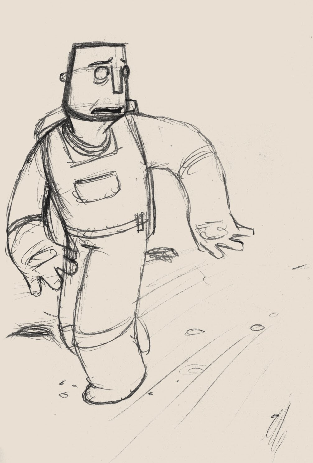
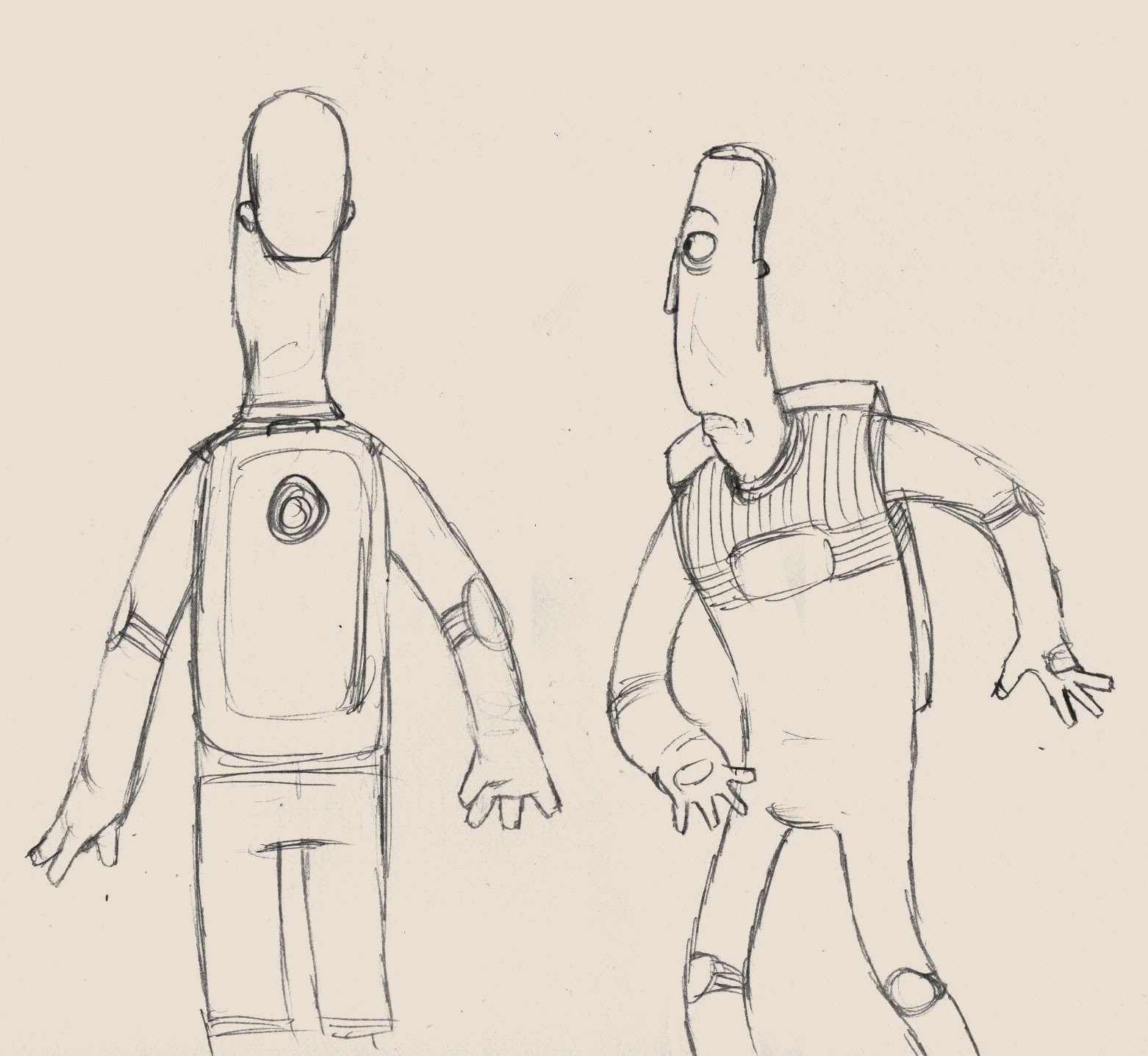
As you can see, I have come up with a new ship design, and today I drew some more in situes for it and also a size comparison with the two main characters and the moon buggy.


t.lucas

21/10/2010

Background design

I've always been a bit scared of colour design, until now I've not put too much thought into it and sometimes it works and sometimes it doesn't. For this film I really want it to be spot on. I want to work with a limited palette of complementary colours. My art strand friends in uni have helped me a lot and one of them gave me the link to a very useful website "Color Scheme Designer" and it has really helped me get the colours dead on. 

So, using this tool and the advice of a few of the art strand team (you know who you are!), here is a layout piece I did to get an idea of the colour scheme I want. I'm very happy with it and I think it could work for the whole film.

I hope you all like it and thanks a lot for the help guys.


t.lucas

Pre-Production

Now that the flash project is over and handed in, pre-productions for our films begins! This week I've been working to pin down characters that I have been working on over the summer and I believe that they are very close to the way I want them. The male and female characters (who are still nameless for now) are practically ready to go. Also, after sticking with a certain ship design for a few months now, a piece of research changed my view on it and the design has since changed somewhat.
This is what I have so far from this week.


 I'm still working on the colour schemes, which will come across in the colour script soon. This is just for an idea of the style.
 Once I had designed and felt comfortable with the designs of the two characters seperately, it was suggested to me that I should begin drawing them together to make sure that they work together on screen. To that end, I decided to draw this in situe which is also one of the shots that will be used in the film. I feel the the two characters do work well together. I designed them so that they would each be an inverse shape of each other. so whereas the male character curves outward, the female curves inward. I also made sure that certain features such as noses, eyes, hands and fingers all worked within the same universe.


 This is the new and improved ship design. The design was originally very rounded, but after doing some further research I decided to make the ship a lot taller and thinner. The whole film is supposed to be geared towards a younger audience and I feel that this newer design is just ridiculous enough to be funny but is still grounded in some possibility.
 And finally, here is another in situe piece for a idea for a scene. At some point while the plant is being experimented on there will be a time lapse of the plant growing, while the male scientist appears to run around wildly doing tests and such, however there will be a few shots where he has down time, has a cup of tea, reads a book, has a nap and so on. This is just an idea for when he gets up to go back to work. I also started to like the idea of making the space suit blue because of this image. Because the panet is going to be made up of a lot of reds and oranges, it makes sense that the space suit would be a cool colour in order to stand out from the background. Also, the blue will fit in with the current colour of the ship.

I hope you enjoy this stuff and as usual if you have any comments or recommendations please don't hesitate to contact me.

t.lucas

15/10/2010

Happy First Contact Day!

This is the finished version of "Happy First Contact Day" with a few changes and enhancements.
It was basically just a matter of tweaking a few things to add a bit more polish.

I hope you enjoy.

t.lucas

14/10/2010

Some character in-situes on the side!

Apologies for the lack of updates recently. This is entirely due to our current flash project. Rest assured, when it is over there will be a regular torrent of updates as we start the pre-production for our films!

Just to tide you over, here are some in-situes for the main character in my film. The character is still not finalised but these show a few of the characters mannerisms and emotions.


I hope you enjoy.

t.lucas

10/09/2010

3rd year film progress update,

I'm currently working on a rough storyboard for my film. I'm finding the process this time is helping me to work out some of the points in the story that I could not quite get across on paper. Roughly about half way through and should be posting what I have so far within the next few days. Once the draft is complete I will take it into flash and convert it into an animatic. I will then hopefully be able to sort out the pacing of certain shots and of the story in general.

All in all, I feel it is coming along nicely...in my head.

Stay tuned, watch this space etc

t.lucas

26/08/2010

A very good idea

I saw the template for this on one of my friend's blogs (Amy's Stuff) and I thought it was a really good idea. Here is the original link.

The process of making it really made me think about what stuff genuinely influences me and inspires me, and what stuff is just pleasing aesthetically. Many of the images here have directly influenced the progression of my next film, but I feel that what I have so far remains my style.


t.lucas

25/08/2010

Update

Some progression made during my week in Bristol. The main characters are coming along I feel, just need a bit more work. Similarly with the ship designs, I have a good idea where they are headed.

I hope you like these designs and in-situes and as usual any comments would be very welcome.

t.lucas


03/08/2010

Further development


This post is just for odd bits of development ideas. I quite like the older feel of this character but I have decided that it would not fit with the story very well, the character needs to be fitter and more active than a character of this age could realistically be. Although on the other hand, it is a low gravity setting so any movements would come a lot easier even to someone of this age...


I quite like the top three images here, all roughly the same character. He is a very simple shape and I quite like the idea of the strap beard. The chin and has the potential to be very expressive, holding the mouth shapes well. I have started to develop this character shape further.


This is the same character in situe and I feel that this is possibly the direction I may take. The face fits well with the shape of the rest of the body. The whole frame is a bit bulkier than other designs I have come up with and I find the face is a lot easier to turn and emote with.


I also came up with this body design. I like it in principle but whether I use it or not depends on how cartooney and child friendly I eventually make the story. This would fit well with a more cartooney style. I don't particularly like the head on this body but quite like the head to the right.


Just some more head designs, I am pleased with the middle and right hand designs, the middle is very simple to draw and I really like the nose and chin. These aspects may go into future drawings.


As usual, any comments on any of the pieces would be of great help. I hope you like them.


t.lucas

Film Development

Just a few pieces of development for my next film. This first image is a rough idea for the layout of a simple poster for the film. I will go over this in illustrator to make it smoother and vectored.


This is a preliminary in situe for the female character. At the moment she is the engineer on the ship so will remain on the ship throughout and so spends all of her time in her jumpsuit. I still need to play around with the layout of the interior of the ship and also the colour scheme but I quite like the colours of the character.


In situe for the male character, getting ready for his shift on the ship


A few more ideas for the design of the body. I quite like the squared off fingers and slightly thinner look than that of my preliminary drawings

The development of this idea still has a long way to go but I like where it is going and the designs are really inspiring the way the story is going in my head. I should hopefully have some rough storyboards and colour charts going very soon.
Any comments on any of the designs would be greatly appreciated.

Thanks

Tom