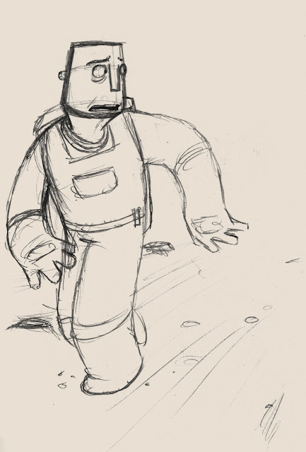
This post is just for odd bits of development ideas. I quite like the older feel of this character but I have decided that it would not fit with the story very well, the character needs to be fitter and more active than a character of this age could realistically be. Although on the other hand, it is a low gravity setting so any movements would come a lot easier even to someone of this age...
I quite like the top three images here, all roughly the same character. He is a very simple shape and I quite like the idea of the strap beard. The chin and has the potential to be very expressive, holding the mouth shapes well. I have started to develop this character shape further.
This is the same character in situe and I feel that this is possibly the direction I may take. The face fits well with the shape of the rest of the body. The whole frame is a bit bulkier than other designs I have come up with and I find the face is a lot easier to turn and emote with.
I also came up with this body design. I like it in principle but whether I use it or not depends on how cartooney and child friendly I eventually make the story. This would fit well with a more cartooney style. I don't particularly like the head on this body but quite like the head to the right.
Just some more head designs, I am pleased with the middle and right hand designs, the middle is very simple to draw and I really like the nose and chin. These aspects may go into future drawings.
As usual, any comments on any of the pieces would be of great help. I hope you like them.
t.lucas


No comments:
Post a Comment